Wednesday, 12 December 2012

Monday, 10 December 2012
Digipack template ideas


Monday, 12 November 2012
magazine advert anaylsis
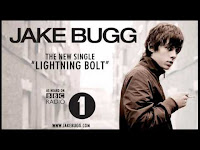
Jake Bugg single advert analysis
although this is the advert for a single we can still apply conventions and ideas to our advert as the artist is from the same genre.
We can clearly see links to his website. this links to the fact indie artists want to make a connection to their audience, and so give extra things to them.
it includes very low key lighting, and possibly a black and white effect. it creates a vintage feel which links to his vintage style music.
The layout is very simple and not too fancy. this links to his indie genre, of simple and not overly manufactured.
the links to radio 1 is a very prominent feature of the video. it will enable the audience to know he is a legitimate artist and maybe think they will enjoy his music due to the fact they like other radio 1 music.
 Vampire Weekend
This, like the Jake Bugg advert, is very simplistic. like a lot of indie artists, they have included the bare minimum, allowing the artist name and album title to be the most prominent feature of the image.

Tuesday, 6 November 2012
Digipack ideas 2
We are considering including the use of techniques such as metaphors, connotations, denotations, symbols, content signs and font.
metaphors/connotations/symbols- The title of the album is tearing back the wallpaper, our front cover is going to be a shot of torn wallpaper with brick wall behind it with the lyrics to Hazel Eyes on it. the metaphor that he is tearing back the wallpaper to reveal what's underneath. the connotations/symbols that he has been hiding behind this wallpaper and he is tearing it back to show his true feelings.
Content signs- we are going to include a guitar in the shot of the front cover to represent the fact he is a genuine real artist who creates his own music.
Font- we have found a font to use on our album cover.
Subscribe to:
Posts (Atom)