Showing posts with label genre research. Show all posts

Monday, 12 November 2012

magazine advert anaylsis


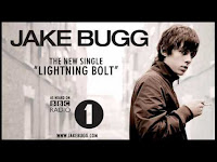
Jake Bugg single advert analysis
although this is the advert for a single we can still apply conventions and ideas to our advert as the artist is from the same genre.
We can clearly see links to his website. this links to the fact indie artists want to make a connection to their audience, and so give extra things to them.
it includes very low key lighting, and possibly a black and white effect.  it creates a vintage feel which links to his vintage style music.
The layout is very simple and not too fancy. this links to his indie genre,  of simple and not overly manufactured.
the links to radio 1 is a very prominent feature of the video. it will enable the audience to know he is a legitimate artist and maybe think they will enjoy his music due to the fact they like other radio 1 music.

Vampire Weekend
This, like the Jake Bugg advert, is very simplistic. like a lot of indie artists, they have included the bare minimum, allowing the artist name and album title to be the most prominent feature of the image.


Tuesday, 6 November 2012

Digipack ideas 2

We are considering including the use of techniques such as metaphors, connotations, denotations, symbols, content signs and font. 
metaphors/connotations/symbols- The title of the album is tearing back the wallpaper, our front cover is going to be a shot of torn wallpaper with brick wall behind it with the lyrics to Hazel Eyes on it. the metaphor that he is tearing back the wallpaper to reveal what's underneath. the connotations/symbols that he has been hiding behind this wallpaper and he is tearing it back to show his true feelings.
Content signs- we are going to include a guitar in the shot of the front cover to represent the fact he is a genuine real artist who creates his own music. 
Font- we have found a font to use on our album cover. 

Digipack micro-elements analysis 2

Colour difference between the front cover, back cover, spine and inlays. 


Newton Faulkner is another indie artist I have researched, and i have decided to analyse his album 'Hand Built By Robots'. 


As you can see the has a background theme of a cloudy sky. On the album this them can be seen across the entire Digipack. the theme is continued on the back cover and both inlays.

However, this theme is not featured on the spine or on the CD cover. Sometimes spines are made a more bright noticeable colour so they can be better seen when on their side. We as a group are planning on using this technique when producing our own digipack.

Friday, 2 November 2012

Digipack analysis- 3


This is the album cover for 'Last smoke before the snow storm' by Benjamin Francis Leftwich. Like many other indie albums covers it includes and aspect of hand drawn/painted effect on the main image. another convention of indie albums covers represented here is the lack of images of the artist. many recent indie album covers don't include images of the artist, this relates to the rebellious aspect of the indie genre, as most other genres include artist images as the main focus point. 


the CD artwork matches the front cover in terms of colour. they also include the same style of font. the font used is a very old fashioned one. it is elegant also relates to the hand drawn effect of the images used in the cove and others like it. 


this cover of Ben Howard's 'Every Kingdom' also uses this effect/technique and is also of the indie genre. 

it is actually an image taken by a camera but has been edited to create a vintage look, possibly using a sepia filter. The use of large, white, centred  font allows his name to stick out and be the first thing the audience notice. the front image also relates to a personal thing in the artists life, he was raised in devon and surfing has always been a big part of his life. It is common in indie music to relate things to personal issues. 

The indie genre is also very linked to rebellion, and breaking trends. in album covers the front and back covers have the same colour of similar colours, however this album breaks this and the colours are very different. As our artist is of the indie genre we may break normal conventions of digipack style and technique to follow the conventions of indie. 


Friday, 26 October 2012

Benjamin Francis Leftwich- Atlas Hands beach shots analysis

Micro element analysis of Benjamin Francis Leftwich's Atlas hands. i am mainly analysing the camera use and the way the location is used and represented in the video.

Throughout the video a large range of shots are used. An establishing shot is used first to set the scene, in the first few seconds it allows the audience to know that the video is being shot at the beach. 
They use low angle and high angles shots to show things like the characters tying each others hair, the characters are also mainly children. This holds connotations of the beach being a place for children and a place to be immature. we are also following this with the use of shots showing our characters eating ice cream, laughing, joking and flying a kite, all associated with immaturity. 
In terms of editing, the cuts made are not made to the beat of the song, this is a convention of the indie genre and relates to rebellion. 

Thursday, 25 October 2012

prolgue analysis

We are planning to use a prologue at the beginning of our video, I have found some music videos that use this technique to see what they are trying to show/represent.


This is the music video for Rihanna's California king bed. this has a 32 second long prologue. in this video it is used to set the scene, with close up and medium shots of both the narrative and performance scenes. it shows a direction and a general story line to the video. it allows the audience to gain an insight into the story behind the video and the lyrics and to connect to the artist without music.

Wednesday, 24 October 2012

Costumes and props.

Costumes 

Our artist will be wearing Chino's, a denim shirt, and some form of casual shoe. It relates well to the indie genre and the age bracket of our target audience. We also think that it will make him look casual and comfortable which also relates to the indie genre, due to the idea of being casual in videos and public appearances, which greatly differs from a pop artist.


Our female will be sporting light blue jeans, which are able to roll up. This is so we can easily film the paddling scene. She will be wearing a wax Barbour style jacket


She will also be wearing red vans. We have decided that we want her to be wearing these because they are practical and casual and go well with our indie theme.


Props 
Guitar - By having the guitar is showing that he is a credible artist and can play his own music. it is also a key convention of the indie genre. 
Microphone stand- to show he is singing his own music and its not auto tuned or greatly tampered with. 
 Ice cream and chips- cliche thing for couples in films, videos and television. also links with the beach location. 
Tea lights- surround our artist to create a more meaningful, romantic atmosphere. also a small source of lighting. Camera phone- to create a handheld effect. to emphasize intimacy and romance between the characters.

Wednesday, 17 October 2012

digipack analysis


This is an analysis of the digipack for the album "love is a four letter word" by Jason Mraz

Monday, 15 October 2012

audience research


this is a video made by one of our group members Danielle, and shows some feedback from target audience members to some questions surrounding the genre of our chosen artist; indie.

Sunday, 2 September 2012

Ed Sheeran research - Task 2

Ed Sheeran  is an English singer, songwriter, and producer. Born in Halifax, before moving to Framingham, he learned to play guitar and started writing songs at a young age. He began recording in 2005 and moved to London in 2008 to pursue a music career. In 2009, inspired by James Morrison, he played 312 gigs. In early 2011, he released his eighth independent extended play, No. 5 Collaborations Project; with it, Sheeran gained mainstream attention. Three months later, Sheeran was signed to Asylum/ Atlantic Records.
Ed Sheeran can be described as an indie rock/acoustic artist. he potrays an image that he is no different to the people who listen to his music. he wears very basic clothing, typically jeans and a t-shirt. in his video's he is represented as a normal person with normal problems. he has also been shown to be a good and charitable person in the video for 'A Team'. 
his concerts are always very basic, he only ever has him playing his guitar and making music on a loop pedal. they are usually very intimate gigs where he interacts and connects a lot with his audience. 
these are two examples.
The music video for Ed Sheeran’s The A Team follows the story of a young prostitute living in London. The fact the video creates a story is very attracting for an audience. it builds anticipation, and curiosity as to what is going to happen to the character created. It has the same effect as a trailer of a movie.
Ed Sheeran can be described as an indie rock/acoustic artist. This song is more of an acoustic song and features just his voice and just his guitar. This allows him to portray an image of reality, and that all the music he makes is from him, and not produced on a computer.  He also shows this by barely featuring in the video. By doing this he makes the video all about the music and the story it creates.
The lyrics relate to the struggles of a young prostitute, this may not be something many viewers can relate to personally but the general struggle of life with little money, drugs, poverty and trying to put food on the table are all things viewers can relate too. The target audience of the audience is a young one, from around 16-25. This is mainly because his songs and videos relate to issues of young people, young love, heart break, loss, unemployment to name a few.
The artist himself is only in the video for about 10 seconds, and he is seen giving money to the homeless girl and giving her some company. This allows him to come across as very charitable and to be shown as a good person.
The rest of the video follows the girl’s story to the end. I think the way in which the girl’s story pulls the audience in is the reason it is a successful video. 
Thursday, 28 June 2012

Emeli Sande Music Video Analysis


Emile Sande – Next to Me Analysis
Introduction-
Emile Sande is a new, young female artist, whose genre can be described as a stripped down soul/gospel.
Analysis
The video is very stripped down and basic, which has connotations reflecting the stripped down sound of her music. It is shot mainly in an empty warehouse which allows all attention to be focused on her, the drummer and the music.
This is even more emphasised with the use of lighting techniques. at one point the lights of the warehouse go out and spotlights shine on Emile and the drummer. this again allows all attention to be drawn to the music and the people creating it. this also has connotations that she wants people watching to know the music is all real, not created on a computer screen. The low key lighting and the high key lighting contrast and could represent how the music shines in the dark.

The way that she is shown playing the piano she makes it clear that she makes her own music and plays it all herself. It shows her audience she is real and genuine. This is also shown in her very basic clothes, she isn’t shown to be a crazy glamorous pop princess, and she is shown to be real. Again, her makeup is very basic, like what any woman could wear during everyday life, not very extravagant. Most of the female artists in the charts in recent years have all been very glamorous, auto tuned, photo shopped, glittery pop princess's. By making a video like this and creating the images she has she has set her self apart form  the rest of the female artists in the charts. although the pop princess's are popular it is a refreshing change for fans to see someone real, genuine and with raw talent. 

The camera angles used are generally very straight shots, which allow her to look directly into the camera, as to make it seem like she is singing directly to her audience. it allows a connection with the people/person watching, which makes you feel like you are part of the video. This all creates an image of reality. There are so many artists with a very pop look, with lots of make-up, huge glittery dresses and lots of male dancers in their videos. The way she is represented is to set her apart from the crowd, people look for real people in their music a lot in recent years, not generated and fake artists. She aims to target these kinds of people.  
It cuts to separate shots of Emile against a white wall, drawing all attention to her. The wall is covered in newspapers and other things of the sorts. This could represent fame, or how she is gaining fame.
The video doesn’t have a moral or many representations, it is one of her first videos, and I believe it represented an introduction to her, her music and her musical beliefs/values.