Monday, 12 November 2012

magazine advert anaylsis


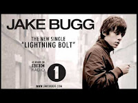
Jake Bugg single advert analysis
although this is the advert for a single we can still apply conventions and ideas to our advert as the artist is from the same genre.
We can clearly see links to his website. this links to the fact indie artists want to make a connection to their audience, and so give extra things to them.
it includes very low key lighting, and possibly a black and white effect.  it creates a vintage feel which links to his vintage style music.
The layout is very simple and not too fancy. this links to his indie genre,  of simple and not overly manufactured.
the links to radio 1 is a very prominent feature of the video. it will enable the audience to know he is a legitimate artist and maybe think they will enjoy his music due to the fact they like other radio 1 music.

Vampire Weekend
This, like the Jake Bugg advert, is very simplistic. like a lot of indie artists, they have included the bare minimum, allowing the artist name and album title to be the most prominent feature of the image.


Tuesday, 6 November 2012

Digipack ideas 2

We are considering including the use of techniques such as metaphors, connotations, denotations, symbols, content signs and font. 
metaphors/connotations/symbols- The title of the album is tearing back the wallpaper, our front cover is going to be a shot of torn wallpaper with brick wall behind it with the lyrics to Hazel Eyes on it. the metaphor that he is tearing back the wallpaper to reveal what's underneath. the connotations/symbols that he has been hiding behind this wallpaper and he is tearing it back to show his true feelings.
Content signs- we are going to include a guitar in the shot of the front cover to represent the fact he is a genuine real artist who creates his own music. 
Font- we have found a font to use on our album cover. 

Digipack micro-elements analysis 2

Colour difference between the front cover, back cover, spine and inlays. 


Newton Faulkner is another indie artist I have researched, and i have decided to analyse his album 'Hand Built By Robots'. 


As you can see the has a background theme of a cloudy sky. On the album this them can be seen across the entire Digipack. the theme is continued on the back cover and both inlays.

However, this theme is not featured on the spine or on the CD cover. Sometimes spines are made a more bright noticeable colour so they can be better seen when on their side. We as a group are planning on using this technique when producing our own digipack.

Digipack micro-elements analysis

Colour difference between the front cover, back cover and spine. 

This is the spine for the album 'Tourist History' by Two Door Cinema Club. The colours used on the spine match those used on the back image. this is a very common concept for album covers. However The front cover is a dark image,  contrasting to the back and spine colours, this allows the album to be shown as breaking conventions and allowing the album to stand out. the inlays on both sides however, both match the back cover as well. 
Another indie artist of whose digipack i have analysed is Ed sheerans album +. this is in a different style to the of the Two Door Cinema Club album. it has the same back cover and spine and front cover design. But it does however have a dark inlay which allows  the orange + on the CD to stick out more. 

i have analysed 5 digpacks produced by indie artists, all of which had a difference in colour or theme between the either the front cover and the back cover, or the front cover and the back cover and spine. We are most likely going to conform to this convention when producing our digipack. however the indie genre is all about being individual and different and we have considered  having all three aspects of the outer digipack (front cover, back cover and spine) different themes/colours as to break these conventions further. or we could challenge this convention by having the front cover and spine different colour to the back cover.